
The Palm PR Dashboard is a full-featured internal platform built to transform how PR campaigns are measured, managed, and communicated. Designed for both Palm PR’s internal teams and external clients, the dashboard acts as a central hub for coverage tracking, strategic planning, performance analysis, and advanced data visualization.
Our vision was to build a seamless, intuitive experience—combining the flexibility of a modern design system with the technical rigor of a multi-tenant SaaS application. This meant bringing together automated scraping, custom metric scoring, cross-platform analytics, and user personas that reflected how real PR teams and clients operate.
Before this platform, Palm’s campaign tracking relied on a fragmented workflow: spreadsheets, CoverageBook exports, manually built Google reports, and subjective campaign reviews. This created multiple pain points:
We aimed to create a PR intelligence engine that merges narrative coverage with hard metrics, creating visibility and strategic clarity.

To design a product that fit seamlessly into the daily workflows of PR professionals, I led a series of discovery sessions with Palm’s directors, client teams, and content specialists. Together, we mapped the full PR lifecycle—from content seeding and placement, to sentiment tracking, engagement analysis, and business outcomes.
We aligned key user journeys and personas:
From the start, we defined role-based permissions and access levels to ensure each user type could securely view or manage relevant data.
User research informed every stage of the design process—from early prototypes to final rollout. Through continuous testing, we uncovered core insights:
Each insight translated into tangible interface changes: simplified navigation, collapsible table views, and preview-driven reporting formats that adapted to user needs.
The application required focused design solutions across multiple touchpoints. Below, we outline three core areas:
Managing objectives and strategies was one of the most time-consuming tasks for Palm’s internal team. Despite having templates in place, onboarding new clients or setting new objectives required constant duplication and manual updates—leading to bloated documentation and inconsistent versions across projects.
"It definitely is the longest process for us since there's so many documents, and we have to go through creating each one and a timeline for each objective. It takes up a lot of our time—time we could be using to generate income." — Charley (Palm PR)
The team’s approach involved four layers:
After defining this structure, they had to manually build timelines, assign responsibilities, and track KPIs—all using external spreadsheets and fragmented tools.
My challenge was to streamline this complexity into a cohesive, easy-to-use digital experience. We focused on four primary objectives:

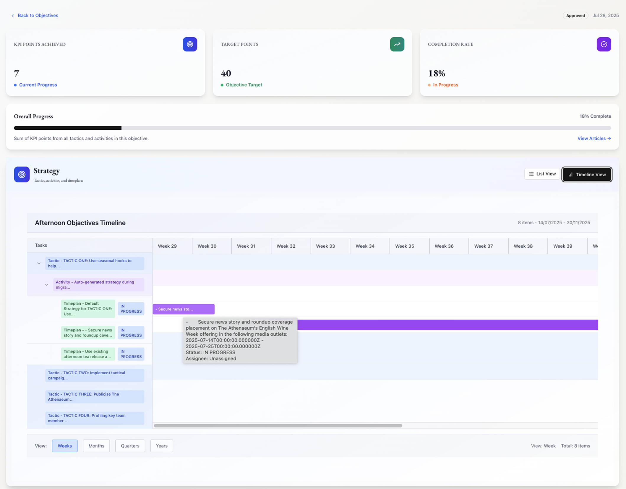
To simplify oversight, we surfaced the most critical metrics at the top of the objective page with three large cards:
Each card was colour-coded and icon-enhanced to help users instantly recognise key performance indicators in line with Palm’s brand aesthetic.
Beneath the metrics, users could toggle between two views:
We designed a hierarchical task structure that visually represents the one-to-many relationships between tactics, activities, and timeplans. This “nested” approach improves clarity and enables users to manage granular details efficiently. It also prepares the structure for export-ready documentation, ensuring that even non-app users (e.g. clients) can follow the project hierarchy.
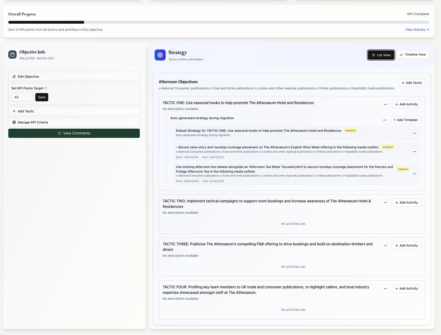
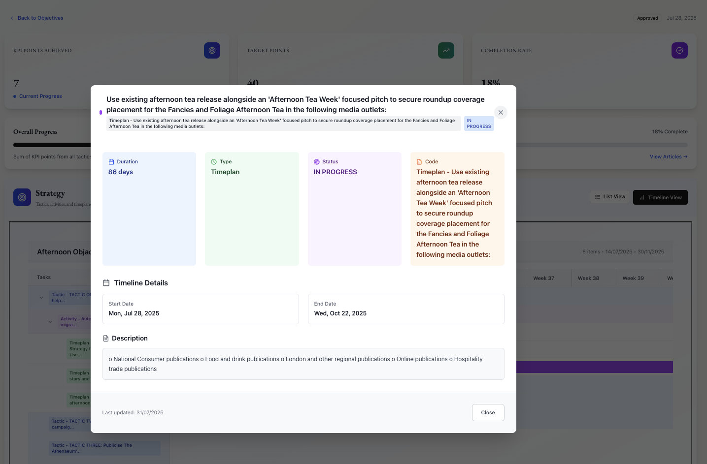
Rather than having to manually craft timelines, this view dynamically builds a visual plan using the entered activities and timeplans. Each layer (tactic, activity, timeplan) is colour-coded for fast scanning. Clicking a timeplan expands to reveal detailed task information.
After internal testing, the team responded positively:
“We absolutely love how much easier it is to manage objectives. The search and filter functions are a game-changer.”
“The timeline automation saves us two days we used to spend manually building out plans in Excel.”
“The nesting really helps us track things better. Being able to assign timeplans to people and see it on the dashboard keeps us on track.”
One key area for improvement:
Once internal teams had set their objectives and KPIs for each client, the next step was defining how coverage would be scored and tracked across campaigns. This process was highly manual—each client had bespoke documentation outlining how much value should be assigned to each coverage type (articles, features, influencer posts, etc.), split by tier, format, and relevance.
📎 [Internal Example: Mollie’s PR Campaign Measurement Criteria — over 10 pages of scoring logic, audience segmentation, and tier breakdowns]
(Note: Cannot be shown due to client confidentiality.)
Each client’s measurement criteria lived in separate documents, often scattered across Word files, spreadsheets, and email threads. This created:
One team member summarised it perfectly:
“We just want something that’s simple, easy to manage, and doesn’t require cross-checking five documents.”
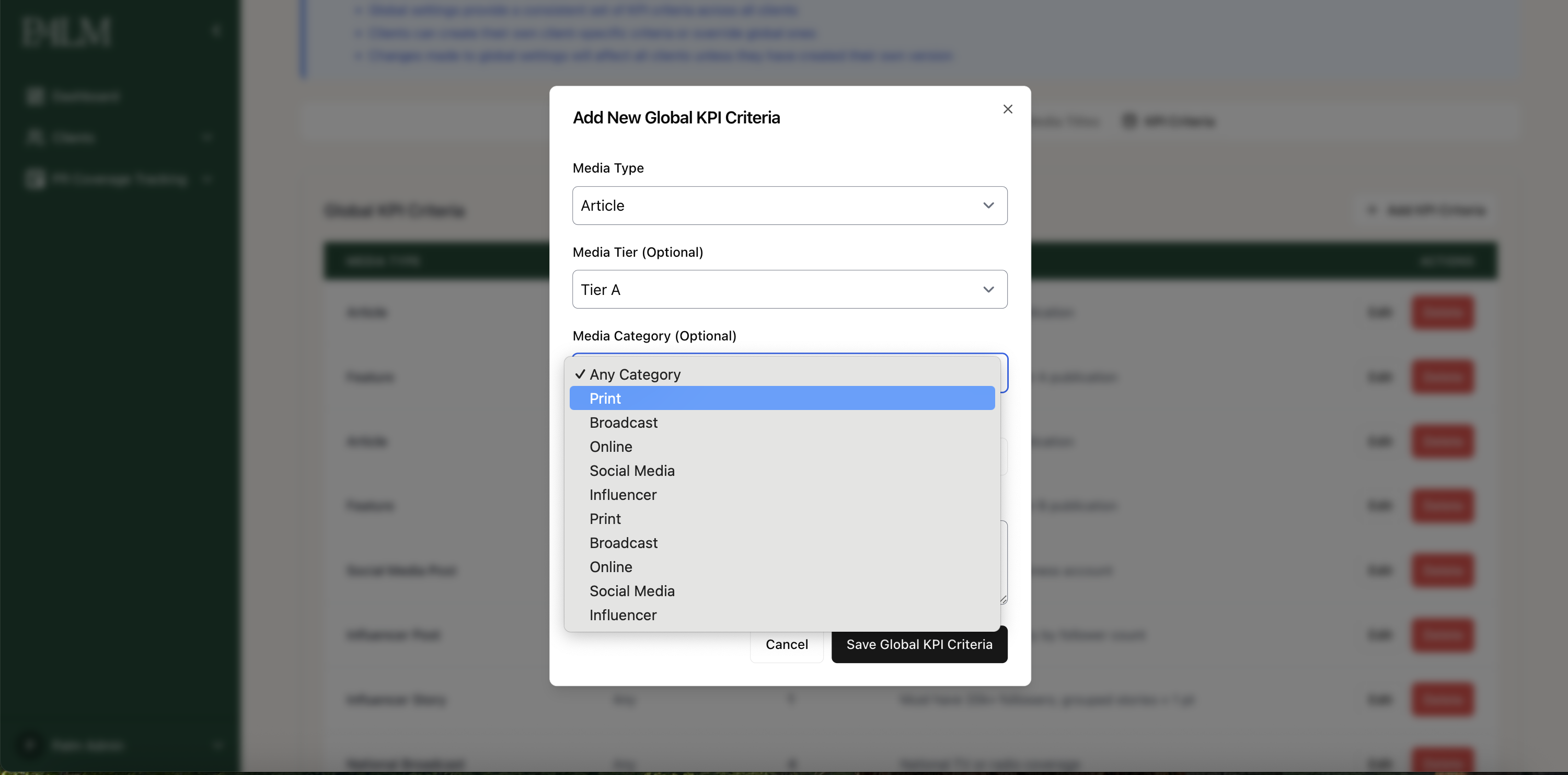
We introduced a Campaign KPI Settings system with two levels:

To mirror the structure of their internal documentation, I designed a clean tabbed interface with 5 key tabs:
Each component could be edited inline, with visibility tags (e.g. Global / Client-Specific) shown clearly.
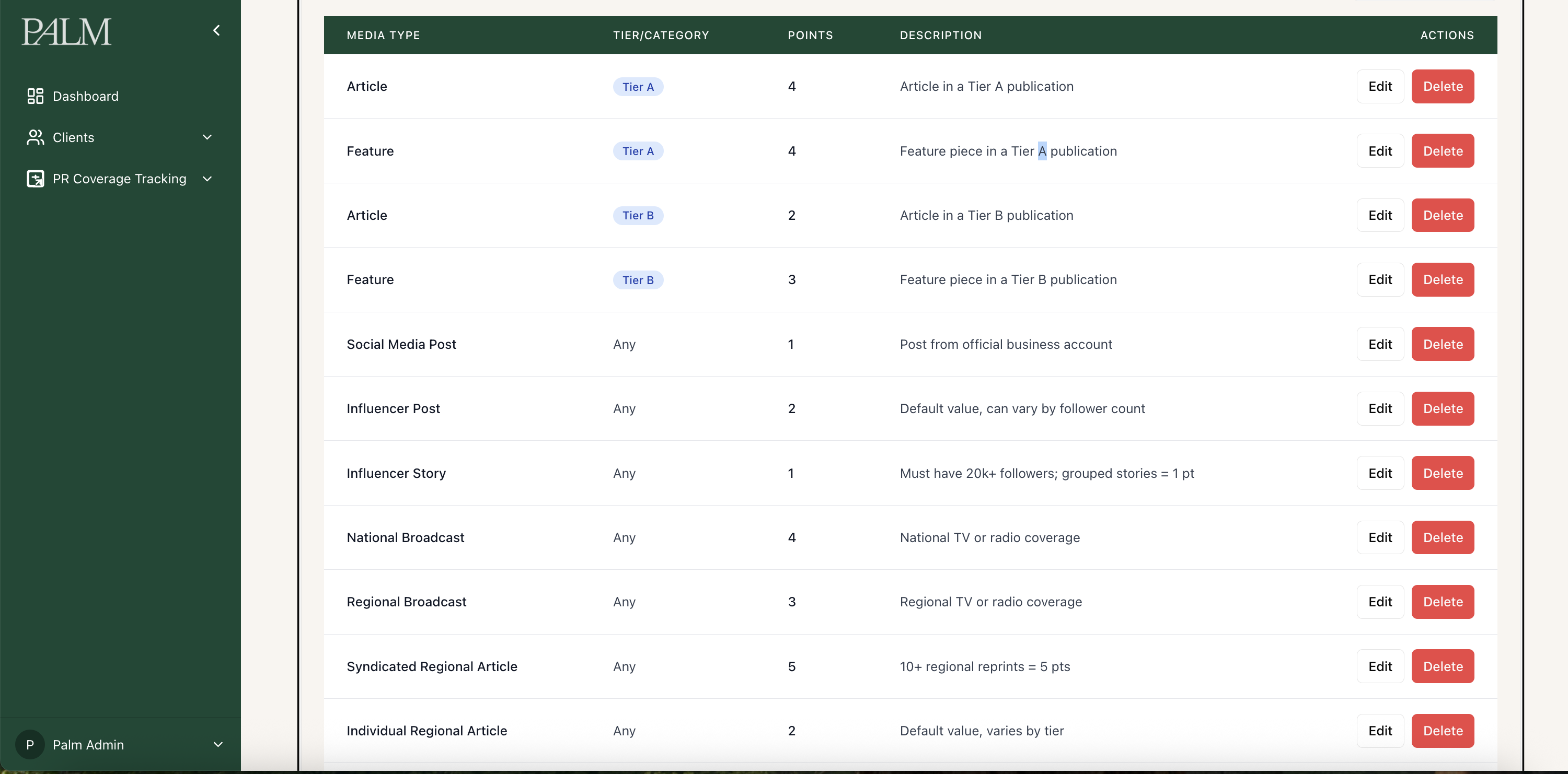
After rollout and testing, the internal team gave immediate positive feedback:
“This is exactly what we need—straight to the point and easy to understand. No confusion at all. Perfect.”
The new system significantly reduced the onboarding time for new campaigns, removed the risk of misapplied scoring, and ensured that coverage could be reviewed and approved based on transparent, client-defined rules.
Include:
The Metrics Dashboard is designed to give Palm PR and its clients a new way to quantify their brand positioning and inform strategic campaign decisions. The goal was to go beyond basic engagement metrics and build a framework that helps PR professionals assess outcomes across five core pillars.
While the specific formulas behind Palm’s proprietary scoring system are under NDA and still in development, I led the UX strategy and collaborated with our product owner, data analyst, and engineers to shape the dashboard’s visual structure, user flows, and data requirements.
To shape the direction of this feature, I conducted working sessions with the Product Owner to explore her long-standing experiences in the PR industry—what she felt was missing, where traditional metrics fell short, and how clients typically struggled to make informed decisions.
Although she didn’t have the exact data points or formulas in mind, I guided her through structured discovery, which enabled her to articulate five strategic areas that matter most to PR clients:
This conversation shifted the focus from raw data to actionable insight—and gave us a clear direction for what a truly valuable metrics dashboard should deliver.
Once the pillars were defined, I worked with a data analyst to map out the kinds of signals, metrics, and external data sources needed to support each pillar. These included:
My responsibility was to design a modular interface that simplifies complexity—delivering strategic clarity through:
To power this system, I implemented Airbyte as our integration solution.
What is Airbyte?
Airbyte is an open-source data integration tool that connects hundreds of platforms (e.g. Google Analytics, Facebook Ads, Semrush) and syncs their data into a unified backend without needing custom-built ETL pipelines.
Using Airbyte allowed us to:
“What’s driving our decline in PR performance this quarter?”
A Palm PR Director logs into the dashboard and notices a dip in the Brand Positioning score across multiple campaigns. They click into the breakdown and see a decrease in Tier A media mentions over the last month, with several articles appearing in lower-tier publications.
Using the filter tool, they isolate data by media type and discover that broadcast and print coverage fell below their target KPI threshold. With this insight, the Director briefs the campaign team to increase Tier A media outreach and allocates more resources to high-authority content planning for the next quarter.
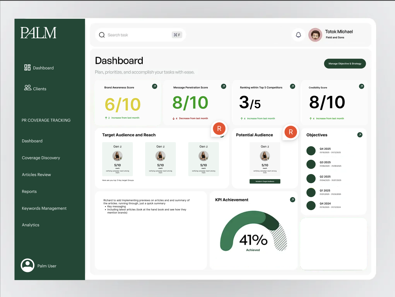
This feature challenged me to bring clarity to a vague but important business need—transforming abstract strategic thinking into an actionable design framework.
We're currently building the next evolution:


Members begin by registering through a custom-designed Divi form, which is captured by MemberPress. Each submission is held in review, pending admin approval via the New User Approve plugin.
The platform was built with Laravel 11 and a modular service pattern. Key backend features:
The UI was built with React, scoped Vue components, and Inertia.js. Custom widgets, modular components, and permission-aware rendering were designed for scale.
Palm PR Dashboard is not just a reporting tool—it’s a living platform that turns PR into an accountable, strategic force. From automated discovery to integrated analytics, it redefines how outcomes are measured, shared, and optimized, We’re entering a new phase—building a custom Data Builder to allow Palm to:
This unlocks true personalization at scale and transforms Palm from a campaign agency to a strategy-led insights partner.